
Episode 3 Do you know why is it so important to create a simple yet informative data visualization?How your design choices impact the visuals?How small details – like text alignment – influence the overall visualization?How gestalt principles guide you? In episode 3 of this mini-series, I discuss the impact of
Bonus Episode 2 – COVID What do we need to do as statisticians in this crisis?Why do we see hardly any people on the news explaining the numbers correctly? I was asked about what we need to do to be more visible as a function? I talked about many problems
Interview with Alberto Cairo The Corona Virus being discussed across the world, with all the visualizations there, it is timely that I am speaking with Alberto Cairo. He is a visualization guru and has written the book “How Charts Lie”. This book helps you as a statistician to understand various
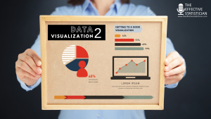
Visualization Episode 2 We all know how to specify a table and our processes support this. However, designing an awesome data visualization does not work this way. Our approach to table specification does not work? In this second episode. I talk about how you can create a great visualization. Here
As statisticians, we are one of the most capable professionals to understand and to relay the right information to the general public about the most talked-about situation – the Corona Virus. In today’s episode, I want to express what’s on my mind and on my heart about this topic. It’s

Interview with Jürgen Hummel Are you curious about how working from home works?How can you know if this is the right set-up for you in general?What are the advantages and disadvantages when working from home?What is a good set-up when having a home office? The COVID-19 outbreak forces many of

Episode 1 Why is visualization so important? How do you determine the goal of visualization?What is the big difference between explanatory visualization and exploratory visualization? In today’s episode, I review the different things you need to consider in creating an effective data visualization when presenting, which is the following:
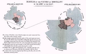
Interview with Deborah Ashby Who is Florence Nightingale, and what is impressive about her? Why would it be interesting to talk about her at the upcoming PSI conference? She’s famous for her visualization. What could statisticians today learn from her about visualization? Despite her having a weak position in society

Interview with Stephen Pyke Many statisticians stay in the statistics department for their entire career. But not Stephen Pyke. After climbing the corporate ladder in statistics very high at GSK, his career brought him to various parts of the pharma world – and his new job is a combination of

Interview with Rachel Phillips and Mark Baillie Do you effectively communicate complex data? How can visualization help you when you aree analyzing data? reporting data? What initiatives and groups work on this topic and will help you? In today’s episode, we talk about the advantages of using visualizations when analyzing and communicating

Real world evidence (RWE) Big data Real world data (RWD) Pragmatic studies There are lots of buzzwords floating around and especially with the FDA having a bigger focus on RWE it’s top of mind for many stakeholders. Many teams in the different pharma organizations concentrate on this type of evidence.

Interview with Liz Cole Do you know what your external profile is? Do you know how to improve it? In today’s episode, Liz Cole and I will dive deep into a topic called content marketing. It’s kind of meta, since this podcast itself originates on these ideas. Does this sound